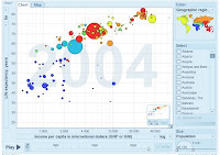
 Readers of my blog will know that I love it when people figure out new ways to visualize data. People are much better at processing visual information than crunching number -- which explains why graphical analysis is so useful in economics, mathematics, and other areas of endeavor.
Ali just sent me a link to this web page full of some amazing ways to visually represent information:
Follow the link for many great examples.Data presentation can be beautiful, elegant and descriptive. There is a variety of conventional ways to visualize data - tables, histograms, pie charts and bar graphs are being used every day, in every project and on every possible occasion. However, to convey a message to your readers effectively, sometimes you need more than just a simple pie chart of your results. In fact, there are much better, profound, creative and absolutely fascinating ways to visualize data. Many of them might become ubiquitous in the next few years.
So what can we expect? Which innovative ideas are already being used? And what are the most creative approaches to present data in ways we’ve never thought before?
Let’s take a look at the most interesting modern approaches to data visualization as well as related articles, resources and tools.
See some of my previous posts on data visualization:
- Science Visualization Challenge
- Graphical Analysis of Patient Status
- Mapping New Testament Social Networks
- Economic Growth and Life Expectancy
- Periodic Table of Data Visualization Techniques
- A Fresh View of the Blogosphere
- Swivel: The YouTube of Data?
- Breathing Earth
- Size It Up!
- Visualizing Economic Development
- Displaying Information
- Places and Spaces
- Visual Complexity
No comments:
Post a Comment