I've read several reviews of Swivel, a new web-based data analysis and sharing site. Some are lauding it as the YouTube of data:
Swivel Co-founders Dmitry Dimov and Brian Mulloy start off by describing their company as “YouTube for Data.” That’s a good start for someone trying to understand it, because the site allows users to upload data - any data - and display it to other users visually. The number of page views your website generates. Or a stock price over time. Weather data. Commodity prices. The number of Bald Eagles in Washington state. Whatever. Uploaded data can be rated, commented and bookmared by other users, helping to sort the interesting (and accurate) wheat from the chaff. And graphs of data can be embedded into websites. So it is in fact a bit like a YouTube for Data.
Academic types are going to go nuts over this. I spent a summer in college running regression analysis models on economic data. Being able to simply upload data to Swivel and then begin to slice and dice the data would have saved a lot of time. And being able to compare our data to what others were doing in related fields could have yielded results that we would never have aimed for.
Aleks at Statistical Modeling seems to like this idea:
I guess that one can upload the data, access data that others have posted, and perform some simple types of analysis. It might not sound much, but having a database of data will remove the need for people to provide summaries of it. Anyone interested in the problem can perform the summaries for himself. This will make data analysis much more approachable than before. This can also become competition to existing spreadsheet and statistical software, and a platform for deploying recent research: it is often frustrating for a researcher in statistical methodology how difficult it is to actually enable users to benefit from the most recent advances in the research sphere.
I do too. I love the thought of being able to do analysis using tools online and being able to share the graphs and results by posting them on my blog or other websites.
I hope this takes off. Right now the site is still in a "preview" stage. I opened an account to try to post some simple data from my research paper I turned in yesterday, but kept getting this error messages when I tried to upload it:
Sorry, our servers seem to have hit a snag. Please try again later.
When I finally got through the process, I discovered it posted my data seven times... The navigation and operation currently have some reliability and ease-of-use issues, but the premise is promising. I hope they get some good competition so we can really start seeing some innovation in online data analysis.
Here's my first simple graph showing the decline of Episcopal and rise of Southern Baptist church attendance from 1970-2000:
It took way too long to get this data uploaded and I couldn't modify the graph to look the way I wanted. This is the closest I could come.
Unfortunately, the blogging feature is also very flakey and won't save any changes to the graph when I modify it to try to fit my blog. I had to modify it, save it, and post it like a regular picture to get it into this post.
Swivel has a lot of very neat features, but it still has a lot of bugs to work out. Stay tuned for future updates.
Sparklines:
I'd be remiss if I didn't also mention I discovered Swivel allows you to create sparklines, in-text graphs like  . These allow you to place data alongside text to convey information at a glance. Ed Tufte is a big advocate of this and spoke at length about them at the Presenting Data and Information seminar my brother and I went to this past May.
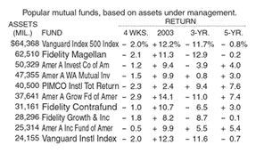
Here's another example of a clever use of sparklines to convey meaningful financial data at a glance. Compare how financial data is typically reported in the newspaper:
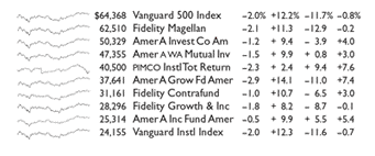
Even with an MBA, the information represented in this data is not intuitively obviously to me. Compare that to how it could be reported with sparklines:
In example with sparklines, it is immediately obvious that all of the securities except PIMCO are moving in unison with one another, while PIMCO is moving in an opposite direction. PIMCO is a bond-based fund, while the rest of them are stock-based funds. No fancy diploma or sophisticated analysis. A clear presentation of the data and a simple glance is all that's needed.


1 comment:
Hey Brian,
thanks for the mention for swivel, you are the first to notice the power of sparklines! I am really glad you brought that up.
as we work through some birthing pains the upload error you saw was our top priority and i am happy to say that it should be resolved now.
- tao (swivel engineer)
Post a Comment