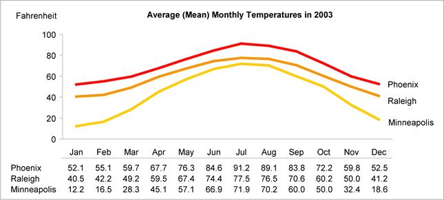
This first graph was from the SAS (statistical software) website and intended to show the power of their software.

(click image for larger view)
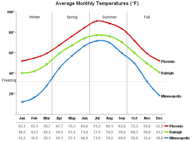
In ten minutes Perceptual Edge was able to produce this graph instead, representing the same data:
Notice the following problems in the example above:
- The attempt to use a graph to display both the shape of the data and provide precise numeric measures results in a cluttered presentation that is hard to read.
- The use of a legend requires that you bounce back and forth between the lines and the legend to determine which lines belong to which cities.
- More visual emphasis has been given to the area surrounding the data region of the graph, rather than to the data itself.
(click image for larger view)
Here are the improvements:
SAS saw this response and then improved it even further.
Assuming that the shape of the data and precise monthly temperatures are both needed by readers, this graph provides a simple but elegant solution.
- A graph and a table have been integrated to do what each does best: the graph shows the shape of the data and the table gives the exact temperatures.
- The inconvenience of the legend has been removed by placing the city labels next to the lines themselves.
- It is now easy to focus on the shape of the data in the graph without distraction from the numbers.
A talented member of the SAS team, Robert Allison, agreed that the original graph had problems and took it upon himself to demonstrate that SAS's software could be used to not only duplicate my solution, but surpass it. Here's the improved solution that Robert sent to me:
(click image for larger view)
This is the same data as in the first graph, but with more information and much, much easier to read. This makes all the difference in the world. (Compare it to the original graph above to see what I mean.)
This simple example shows the power of spending just a little bit of time thinking about how to present your information and ideas to others. In economic terms, if you reduce the cost of someone trying to understand what you're saying, it is much more likely many more people will be willing to listen.
Additional Info:
See more examples of good improvements to bad graphs here.
See my previous post with great examples of visual displays of information.
Here's some info on a one-day course on Presenting Data and Information, taught by Edward Tufte. My brother and I attended this back in May. Dr. Tufte is a very eloquent speaker with a passion for teaching others to present information with clarity. I heartily recommend any of his books on this topic.
Hattip Statistical Modeling, Causal Inference, and Social Science
No comments:
Post a Comment