
I have always been a visual thinker and get excited when I see new ways of clearly representing information. You can imagine my delight when I stumbled on the website for Places and Spaces:
Here’s a description of the initial exhibit:
Cartography of the Physical and Abstract:
An exhibition created to demonstrate the power of maps to understand, navigate, and manage not only physical places, but also abstract information spaces.
You can browse through a wonderful collection of cartographic, concept and domain maps. Below are a few of my favorites:
An exhibition opening April 4 at The New York Public Library focuses on innovative methods of using maps and globes to convey and explain complex scientific developments. Geographic maps of physical places have guided mankind's exploration for centuries, drawing a line between the known and unknown. The maps in Places & Spaces: Mapping Science chart abstract concepts in and across a variety of scientific disciplines using information from journals, publications, and public dialogue as landmarks and guideposts. In a manner similar to the maps that explorers used, these new kinds of maps track the emergence, evolution, and disappearance of scientific topics to help identify the most promising areas of research. Places & Spaces: Mapping Science features twenty maps, a series of globes by Ingo Günther, and interactive illuminated diagrams by W. Bradford Paley. The exhibit is on view at The New York Public Library's Science, Industry and Business Library at 34th Street at Madison through August 31, 2006. Admission is free.
(click on the title to learn more details about each map or on the map itself to see a larger view)
Map of World Poverty
Dymaxion World Map Unfolded
The Chronic Poverty Centre has just published a Chronic Poverty Report, which measures chronic poverty as the amount of people who spend most or all of the time in destitution, i.e. on an income of less than $1 a day. It's interesting stuff, but one thing really grabs the attention: this map (click for a larger version) of chronic poverty around the world, where a country's size represents its number of chronically poor, and it's shade the proportion of the whole population who are chronically poor.

Map of Science
The Dymaxion map of the Earth is a projection of a global map onto the surface of a polyhedron, which can then be unfolded to a net in many different ways and flattened to form a two-dimensional map which retains most of the relative proportional integrity of the globe map. Description taken from: http://en.wikipedia.org/wiki/Dymaxion_projection

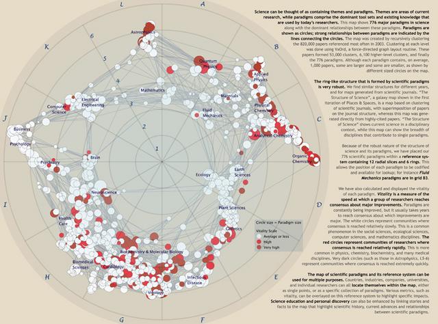
Map of Scientific Paradigms
Shown is the very first map of all of science. It was generated based on 36,720 multidisciplinary documents for a 15-year sampling window from 1981 through 1995. A combination of fractional citation counting and co-citation clustering via multidimensional scaling was used to extract four nested levels of clustering via single and complete linkage. Major disciplines of science emerge from a bottom-up aggregation of highly cited papers.

Map of Entertainment
Science can be thought of as containing themes and paradigms; themes are current areas of research while paradigms comprise the dominant tool sets and existing knowledge that are used by current researchers. To generate this map, Boyack and Klavans recursively clustered (using the VxOrd graph layout tool) the 820,000 most important papers referenced in 2003, resulting in 776 paradigms. The most dominant relationships between paradigms were also calculated and are shown as lines between paradigms.
And of course, the ever famous Napoleon’s March to Moscow:
"ET-Map" - a multi-level category map of the information space of over 100,000 entertainment related Web pages listed by Yahoo!. ET-Map is one of a number of information visualisation technique developed by researchers,lead by Hsinchun Chen, at the Artificial Intelligence Lab, University of Arizona, USA. [For more information see the Map of Month article, "A Map of Yahoo!" in Mappa.Mundi Magazine.]

There are also other versions of this Napoleon graph. This map has been made particularly famous by Edward Tufte, a statistics professor at Yale. I met up with my old college roommate Dave and his family in DC a few weeks ago. Dave’s been working in graphics design and we got to talking about Tufte and this graph, considered to be perhaps the best statistical graph ever. My brother is a statistician and has been a very big fan of Tufte and his books:
Charles Joseph Minard was prominent French engineer who lived from 1781 to 1870. He learned to read and write when he was only four years old, and was a student of the famous mathematicians Lagrange and Fourrier. He like to study streams and physics, his profession was to design and oversee civil engineering projects for example bridges, railways, canals, locks and dams. Figurative maps and graphic tables were among his favorite studies. He did not care for dry and complicated columns of statistical data, he felt this kind of analysis and the discussion required a great sustained mental effort, so he substituted images mathematically proportioned so that the first glance could "take it all in" so the viewer could understand the information without fatigue which could also lead to unforeseen comparison. This map was done near the end of his life and is probably the best statistical graphic ever drawn. It portrays the losses suffered by Napoleon's army in the Russian campaign of 1812. Beginning at the Polish-Russian border, the thick band shows the size of the army at each position. The path of Napoleon's retreat from Moscow in the bitterly cold winter is depicted by the dark lower band, which is tied to temperature and time scales.

- The Visual Display of Quantitative Information
- Envisioning Information
- Visual Explanations: Images and Quantities, Evidence and Narrative

As I was putting this post together, I visited Tufte’s website and found out he’s giving a one-day course on “Presenting Data and Information” in Arlington, VA on May 22nd, 23rd and 24th. (He’s presenting the one day class three times.)
Topics covered in this course include:
- fundamental strategies of information design
- evaluating evidence used in presentations
- statistical data: tables, graphics, and semi-graphics
- business, scientific, legal, financial presentations
- complexity and clarity
- effective presentations: on paper and in person
- use of video, overheads, computers, and handouts
- multi-media, internet, and websites
- credibility of presentations
- design of information displays in public spaces
- animation and scientific visualizations
- design of computer interfaces and manuals
I have relatives coming into town on the 23rd, but I just might be able to make the course on the 22nd. As an economist to be, one of my goals is to become an effective communicator of economic ideas. With this goal in mind and with all the good stuff I’ve heard about Tufte and his books, this course just might be worth considering…
Hattip to Visual Complexity for pointing to the “Places and Spaces” exhibit.
No comments:
Post a Comment