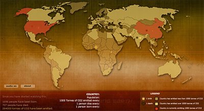
This is a fantastic animated world map called "Breathing Earth". Here is a description of it from information aesthetics:
a simple animated geographical visualization that shows the relative impact different countries have on climate change. different icons represent the statistical time-varying data of all countries (i.e. birth rate, death rate & carbon dioxide emission), which are 'simulated' in real time.
While I remain skeptical of much of the science and (particularly) the solutions related to global warming (too much seems far too connected to politics to believe hasn't been influenced by it), I must say this is a fantastic example of data visualization. It certainly drives home the point of not only levels of carbon emissions, but also of population growth in varying countries.
One thing to point out is that this map is illustrative of the effects of: 1) differing energy prices, 2) levels of relative wealth, and 3) population sizes of the various countries. It seems that nearly all of the disparity in carbon emissions between nations can be traced to a combination of these three factors.
No comments:
Post a Comment