Lifehacker:
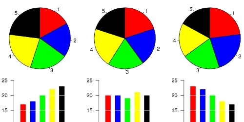
Pie charts look cooler than other kinds of charts. They're based on pie, after all, and seem less accountant-like than bars, bubbles, and lines. They are, however, often a very wrong way to represent subtle but important differences.Image via Wikipedia.
Revolutions, a blog dedicated to the statistical programming language dubbed "R," points out a section of pie charts' Wikipedia page highlighting the well-documented deficiencies of pie charts. Here's the multi-user consensus on what pie charts can and can't do:
Most [research] subjects have difficulty ordering the slices in the pie chart by size; when the bar chart is used the comparison is much easier ... Similarly, comparisons between datasets are easier using the barchart. However, if the goal is to compare a given category (a slice of the pie) with the total (the whole pie) in a single chart and the multiple is close to 25% or 50%, then a pie chart works better than a bar graph.
Put another, less dictionary-sounding way, pie charts are great at (dramatically) showing that Opera, Chrome, Epiphany, Konquerer, and Skyfire combined make up a small slice of Internet Explorer's overall share of browser usage. To illustrate the differences between each of those alternative browser's gains, losses, and shares, though, stick with something with horizontal or vertical scales.
Don't feel bad if you or someone you work with has woefully misused pie charts. Spin that grief into a smirk-inducing short story in the comments.
No comments:
Post a Comment