Becoming an Excel Ninja

These are some
great ideas:
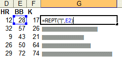
Microsoft Excel's charts are powerful, but boy are they a pain to use, especially if you just want quick, simple bars alongside your data. Well, no more: The blog at Juice Analytics has some very cool tips for making instant bar charts from your data. All it takes is the REPT() function, which will repeat any bit of text as many times as you want, and the | symbol. It certainly doesn't sound earth-shattering, but the results are impressive. The blog post goes on to show how you can use conditional formatting to color-code the bars according the value, and in a follow-up post there's even more impressive trickery. If you find yourself using Excel a lot, don't miss these tips.
 These are some great ideas:
No comments:
Post a Comment