This is not something new, but it is something good. (This has been on the internet for several years.) SmartMoney.com has a
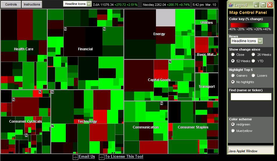
map of the market that allows you to look at gains and losses in various sectors of the stock market. It's a useful visual tool for understanding how different areas of the economy have done on a daily, YTD, six-month or yearly basis. The size of each sector on the map also represents the relative market share that sector comprises of the total market measured by this map. Likewise, the relative size of each company in its appropriate sector represents the market share that company posseses.

The map is color-coded by company to indicate if stock prices for companies have increased or decreased over a specified amount of time. The brightness of color represnts the magnitude of gains or losses in stock price. You can also select specific companies and get detailed prices, financial statistics, analysis, and news for each one, simply by pointing and clicking.
Check it out and have fun! This is a brilliant way to convey a lot of useful information in a simple, non-technical, easy to understand way. This makes me wonder how else interactive technology and novel use of graphics (static or animated) can help convey other complex ideas? What other non-technological methods can be used? Certainly important questions a future economist should be asking...
No comments:
Post a Comment