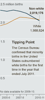
Non-Hispanic whites accounted for 49.6 percent of all births in the 12-month period that ended last July, according to Census Bureau data made public on Thursday, while minorities — including Hispanics, blacks, Asians and those of mixed race — reached 50.4 percent, representing a majority for the first time in the country’s history...Read the whole thing. And see the Census Bureau's press release.
While over all, whites will remain a majority for some time, the fact that a younger generation is being born in which minorities are the majority has broad implications for the country’s economy, its political life and its identity…
Whites still represent the single largest share of all births, at 49.6 percent, and are an overwhelming majority in the population as a whole, at 63.4 percent. But they are aging, causing a tectonic shift in American demographics. The median age for non-Hispanic whites is 42 — meaning the bulk of women are moving out of their prime childbearing years.
Latinos, on the other hand, are squarely within their peak fertility, with a median age of 27, said Jeffrey Passel, senior demographer at the Pew Hispanic Center. Between 2000 and 2010, there were more Hispanic births in the United States than there were arriving Hispanic immigrants, he said.
The result is striking: Minorities accounted for 92 percent of the nation’s population growth in the decade that ended in 2010…
“If the U.S. depended on white births alone, we’d be dead,” Mr. Myers said. “Without the contributions from all these other groups, we would become too top-heavy with old people.”
Matthew Yglesias raises an excellent question: With the rise of interracial marriage in America, how accurate are majority-minority racial categorizations? (Yglesias has 25% Cuban, 75% Eastern European ancestry.)
Of course, this isn't the first time in America's history when white birth's were the minority.
Below is a breakdown by the Washington Post of Washington DC's population distribution for babies under 1 year of age and the population as a whole. The Post also has an interactive map that shows population changes by county across the United States.
Below are more graphs of these demographic changes by Live Science:


No comments:
Post a Comment