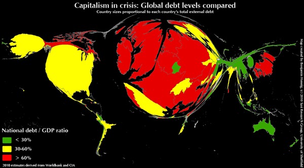
This map, by Benjamin Hennig of the University of Sheffield’s SASI Research Group, shows the debt load around the world. The size of each country represents the total external debt of that nation (using 2010 World Bank estimates). The color of each country, on the other hand, shows the size of national debt relative to the size of each country’s economy.
Note the giant red balloon that represents Ireland, Great Britain and Western Europe, versus the thin blade of green that represents much of East Asia. This contrast might help you understand why the West is getting fidgety about Eastern tigers like China.
You can find many other maps scaled to adjust for different economic factors — like life expectancy, physicians working per 100,000 people, and trade union membership rates — here.
Thursday, April 22, 2010
Mapping World Debt
Subscribe to:
Post Comments (Atom)

No comments:
Post a Comment